Craig’s Cookies
Rebrand
Overview
This rebrand aims to evolve Craig’s Cookies from a beloved small business into a bold and meaningful brand identity that stands strong among growing competition in the cookie shop market. Centred on its core values of playful flavours and community connection, the refreshed branding embraces a more vibrant, human-first personality. By leaning into its fun-loving spirit and heartfelt purpose, Craig’s Cookies can better differentiate itself and continue to build lasting relationships with customers.
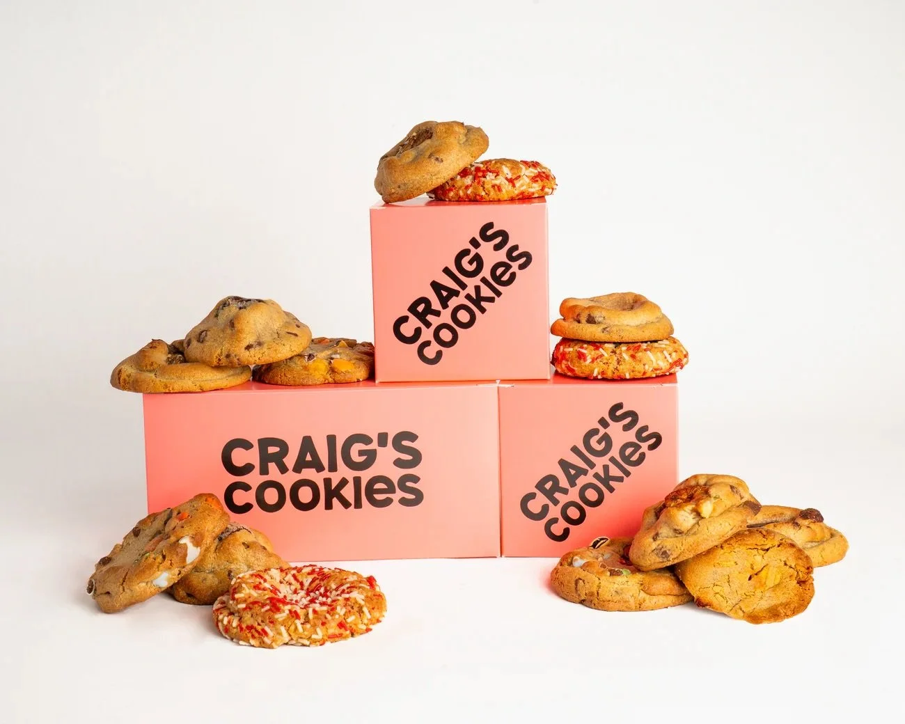
Packaging is one of the most prominent ways Craig’s Cookies communicates its brand identity to customers. It not only surrounds the product but also signals to others that someone is a Craig’s Cookies consumer. After researching competitors, it became clear that many cookie shops rely on similar plain pink boxes with minimal branding. By introducing a human-centered logo and bold, playful patterns, Craig’s Cookies can create a more memorable presence and give customers a stronger visual reference to the brand.
Role
Sole Designer
Tools
Illustrator, Photoshop, After Effects


The original Craig’s Cookies brand, while straight forward, does not leave it’s customers with any memorable attributes. If the name is forgotten, then so is the brand.
OLD LOGO
OLD PACKAGING
Craig’s Cookies is best recognized for its signature pink box and bold, typographic logo. The brand is also widely celebrated for its strong support of the LGBTQ2S+ community, made visible through its annual Pride Month packaging and year-round heart-shaped pride stickers.
Brand Voice and Purpose
At the heart of Craig’s Cookies is a commitment to fun, flavour, and community. The brand’s origin story, baking cookies for friends and family, emphasizes connection and care, reminding us that these are not just his cookies, they’re ours.
Strengthening community engagement initiatives will help grow and reinforce the inclusive, family-like spirit that defines the Craig’s Cookies brand.
