

Craig’s Cookies
Rebrand
Overview
This rebrand aims to evolve Craig’s Cookies from a beloved Canadian business into a bold and meaningful brand identity that stands strong among growing competition in the cookie shop market. Centred on its core values of playful flavours and community connection, the refreshed branding embraces a more vibrant, human-first personality. By leaning into its fun-loving spirit and heartfelt purpose, Craig’s Cookies can better differentiate itself and continue to build lasting relationships with customers.
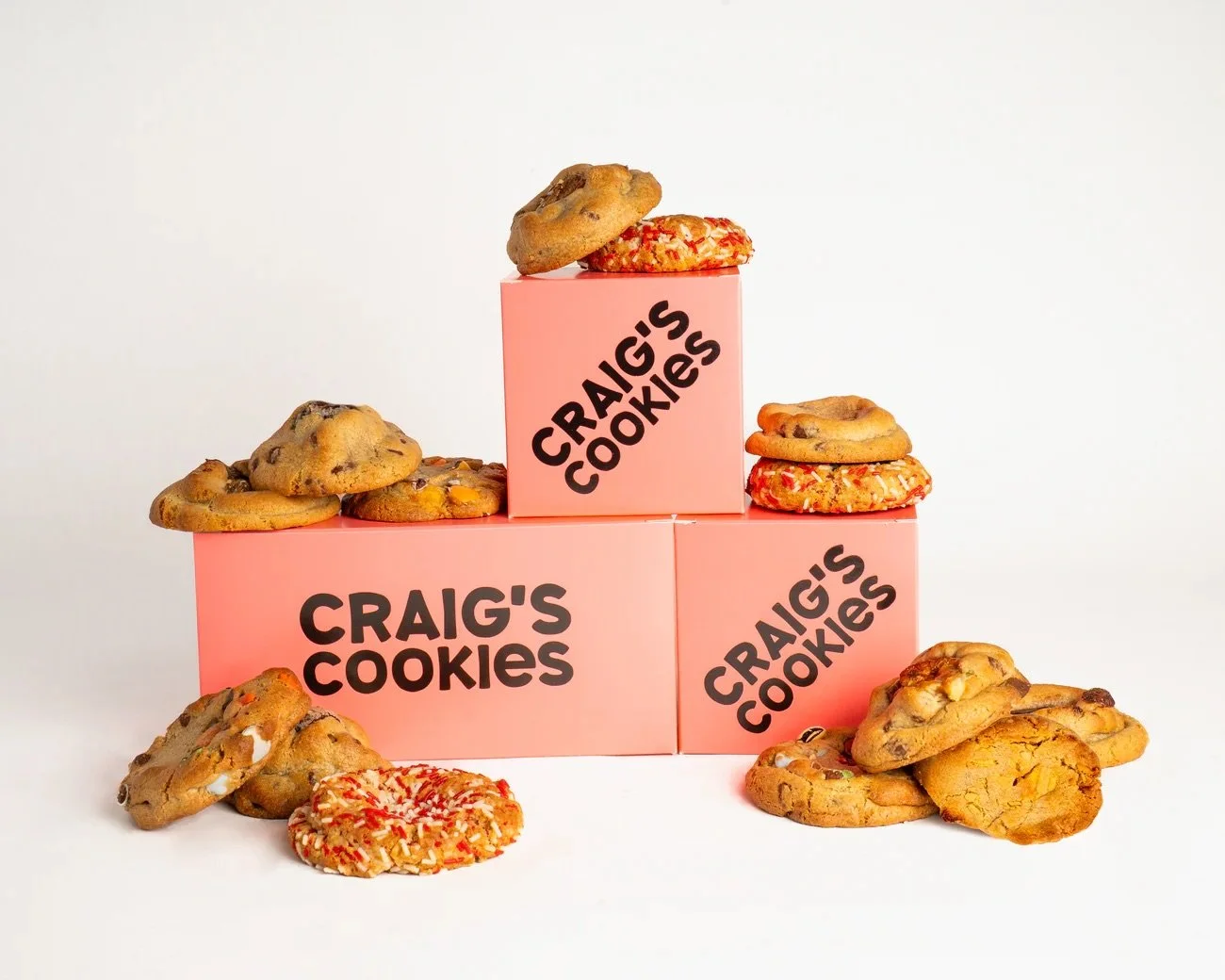
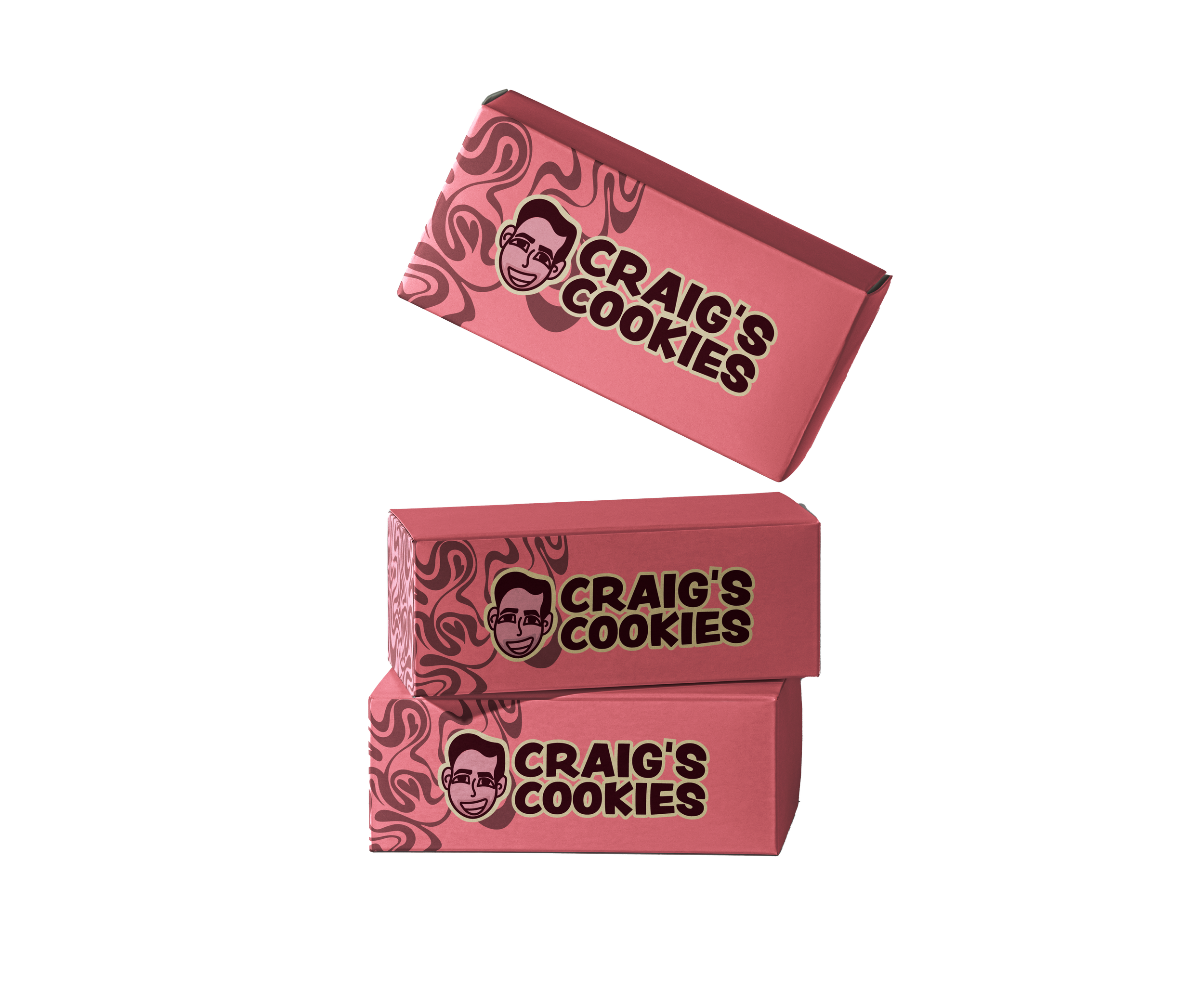
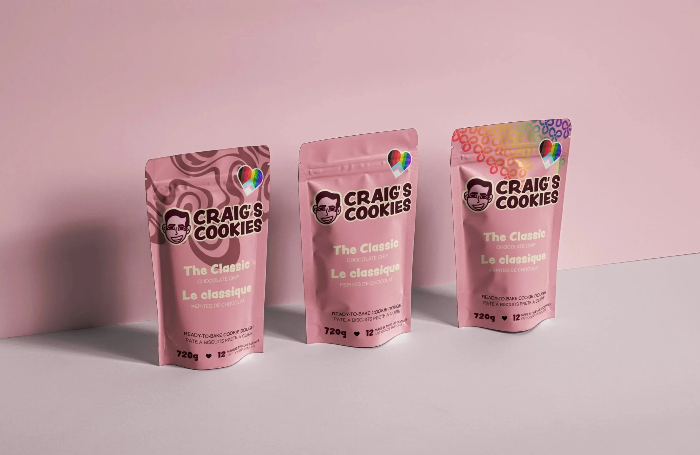
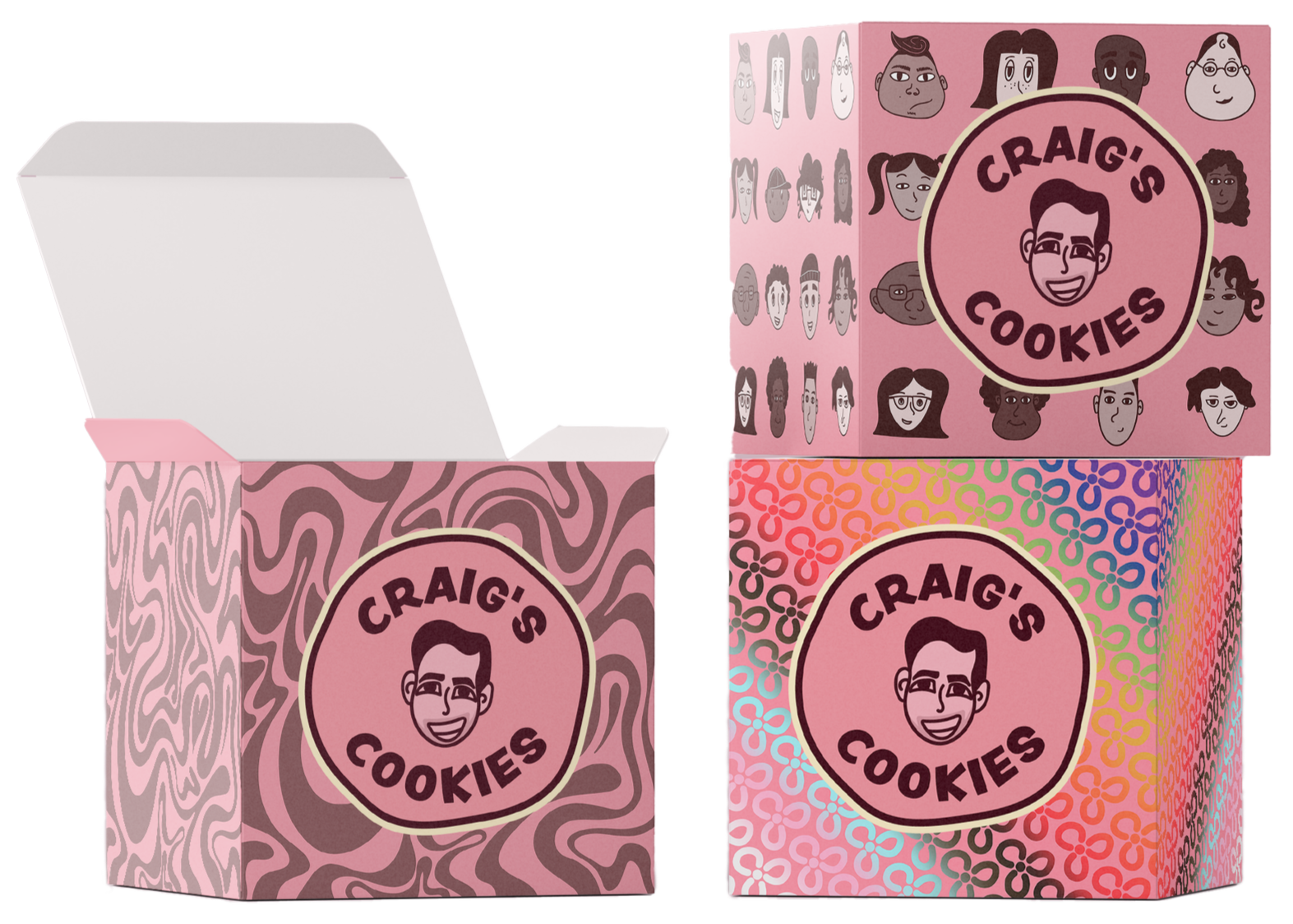
Packaging is one of the most prominent ways Craig’s Cookies communicates its brand identity to customers. It not only surrounds the product but also signals to others that someone is a Craig’s Cookies consumer. After researching competitors, it became clear that many cookie shops rely on similar plain pink boxes with minimal branding. By introducing a human-centered logo and bold, playful patterns, Craig’s Cookies can create a more memorable presence and give customers a stronger visual reference to the brand.
Role
Sole Designer
Tools
Illustrator, Photoshop, After Effects


OLD LOGO
The original Craig’s Cookies brand, while straight forward, does not leave it’s customers with any memorable attributes. If the name is forgotten, then so is the brand.
OLD PACKAGING
Craig’s Cookies is best recognized for its signature pink box and bold, typographic logo. The brand is also widely celebrated for its strong support of the LGBTQ2S+ community, made visible through its annual Pride Month packaging and year-round heart-shaped pride stickers.
Brand Voice and Purpose
At the heart of Craig’s Cookies is a commitment to fun, flavour, and community. The brand’s origin story, baking cookies for friends and family, emphasizes connection and care, reminding us that these are not just his cookies, they’re ours.
Strengthening community engagement initiatives will help grow and reinforce the inclusive, family-like spirit that defines the Craig’s Cookies brand.
Rebrand Direction
While long-time supporters understand the brand’s inclusive and joyful culture, new customers and passersby may not grasp this message through packaging alone. As more cookie brands adopt similar pink boxes and bold typography, Craig’s must elevate its identity to stand out and remain instantly recognizable, especially with the same impact as its Pride-themed packaging.
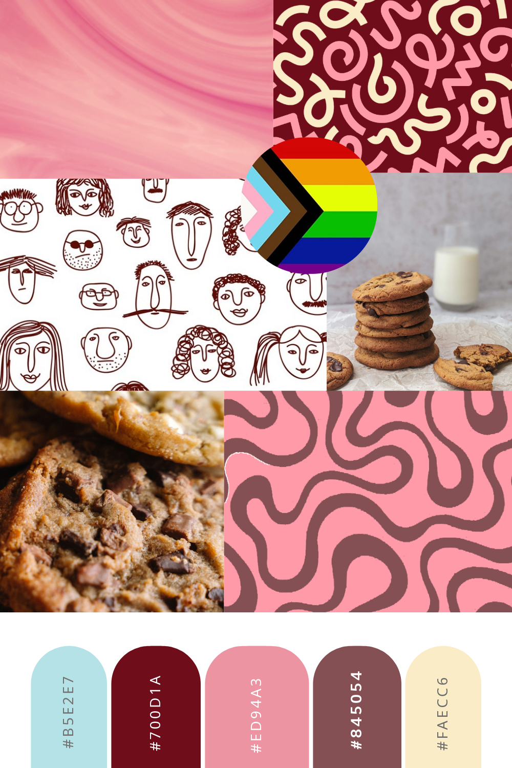
Rose Taupe
#7C5154
0%, 35%, 32%, 51%
124-81-84
Vanilla
#FAECC6
1% 6% 27% 0%
250-236-198
Craig’s Pink
#ED94A3
0%, 56%, 17%, 0%
237-148-163
Chocolate Cosmos
#470B1C
44%, 91%, 66%, 64%
71-11-28
Colour Palette
Expanding the colour palette with allow for many more design possibilities. Incorporating warm light and dark tones to the palette while keeping the Craig’s Pink at the centre focus will help bring dimension to the Craig’s brand and remain familiar to its consumers.

Primary Logo
To bring more warmth and personality to the Craig’s Cookies name, I redesigned the logo with a friendly illustration of Craig himself at the centre. His smiling face helps make the brand feel handmade and people-first. Framing the logo in a circular, cookie-like shape adds to its playful, welcoming vibe while reinforcing the idea of community.
Secondary Logo
Logo Animation
To extend the brand’s identity into digital spaces, I created a playful Craig’s Cookies logo animation for use on social and web platforms. The animation begins with a cookie rolling across the screen, guiding the viewer’s eye before revealing the logo and Craig himself, the man behind the cookie.
It’s a simple yet charming motion that captures the essence of the brand: fun, personal, and full of heart.


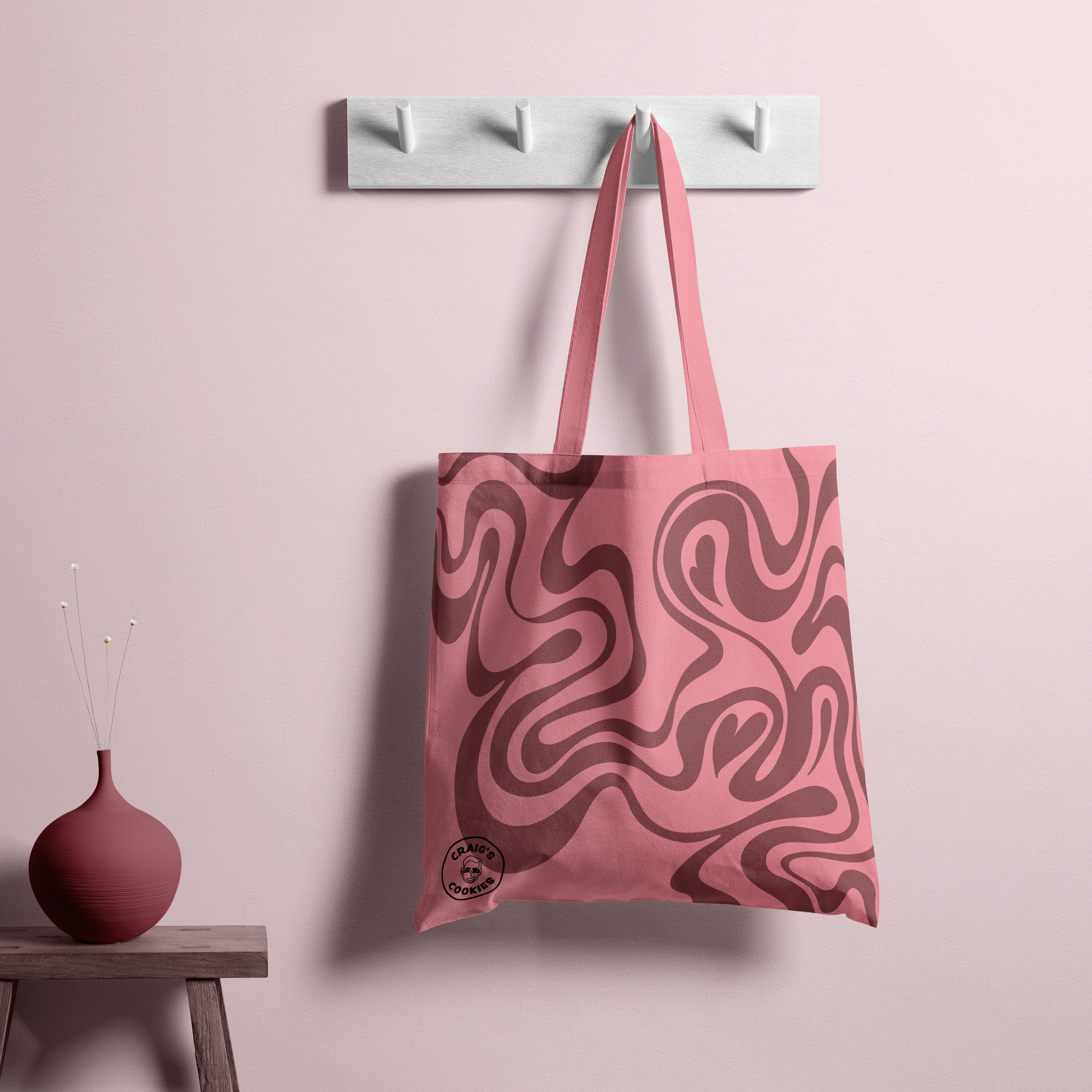
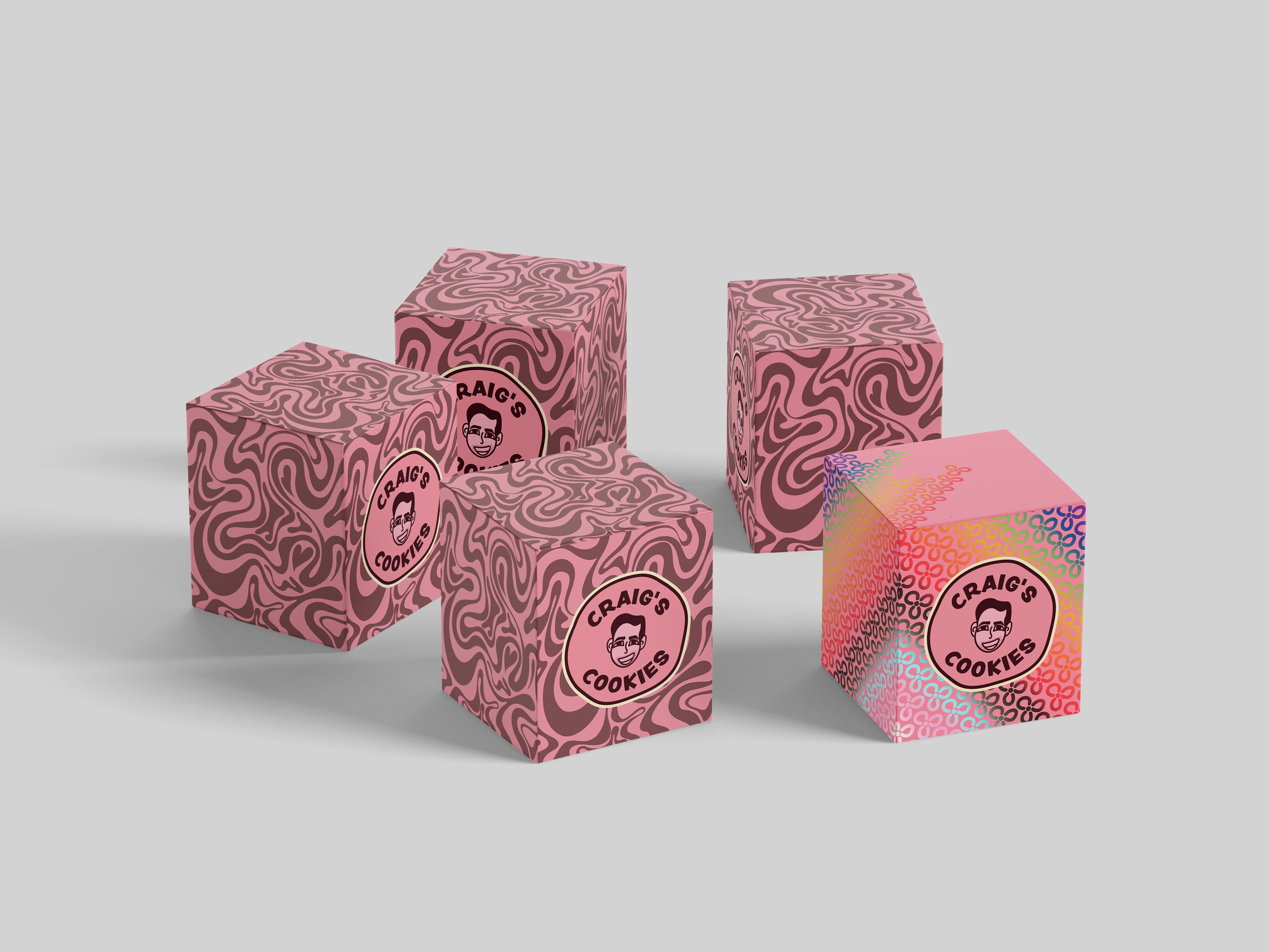
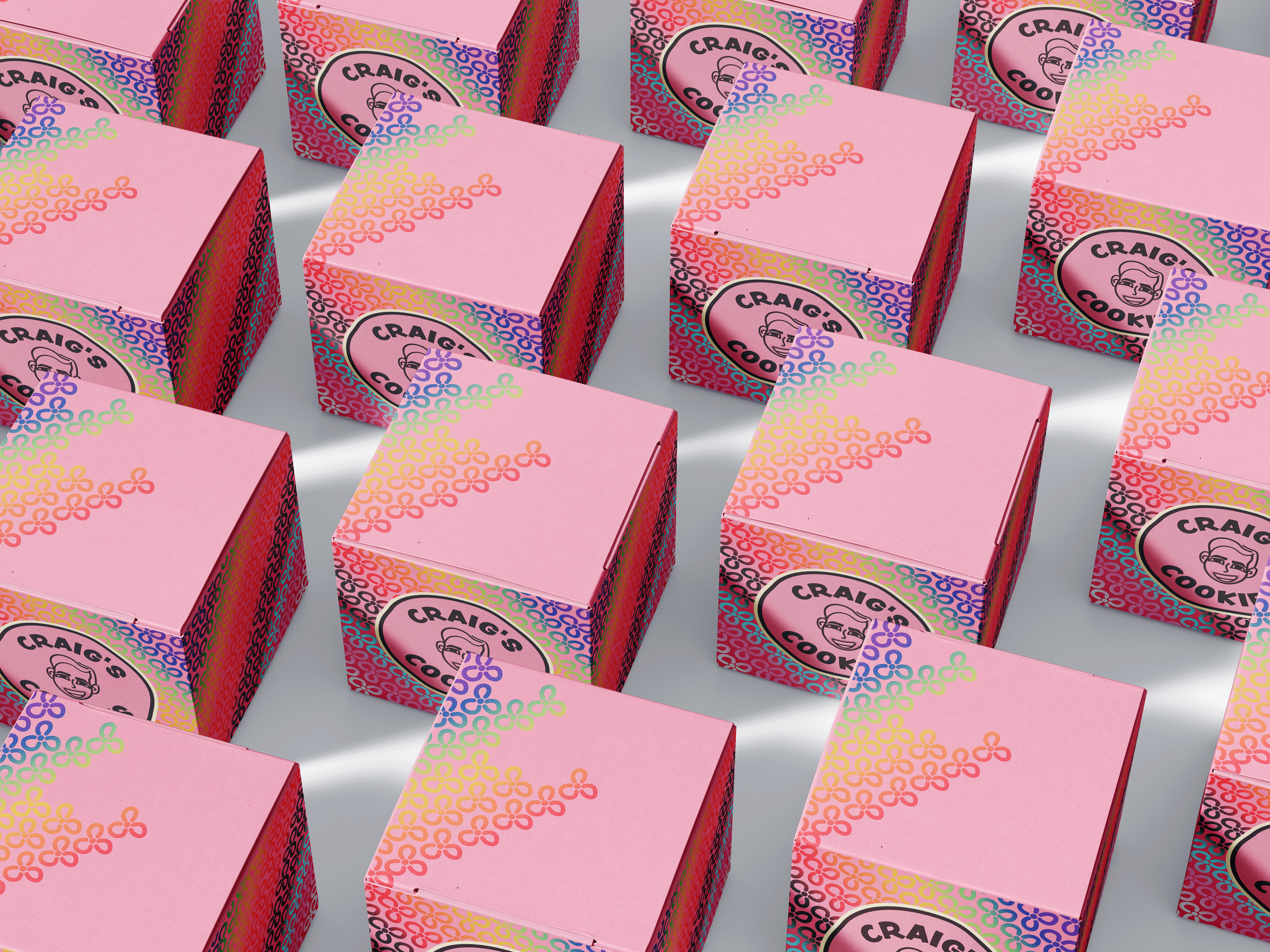
Brand & Packaging Patterns
To reflect the brand’s bold and playful personality, I developed a trio of distinct patterns that can be used across packaging, interiors, merchandise, the website, and broader brand applications.

The Chocolate Swirl
Primary Pattern
Inspired by the swirl of chocolate in Craig’s Cookies dough, this pattern blends abstract and literal visuals to create a dynamic and adaptable design. It helps establish a recognizable brand identity while remaining flexible for future evolution.


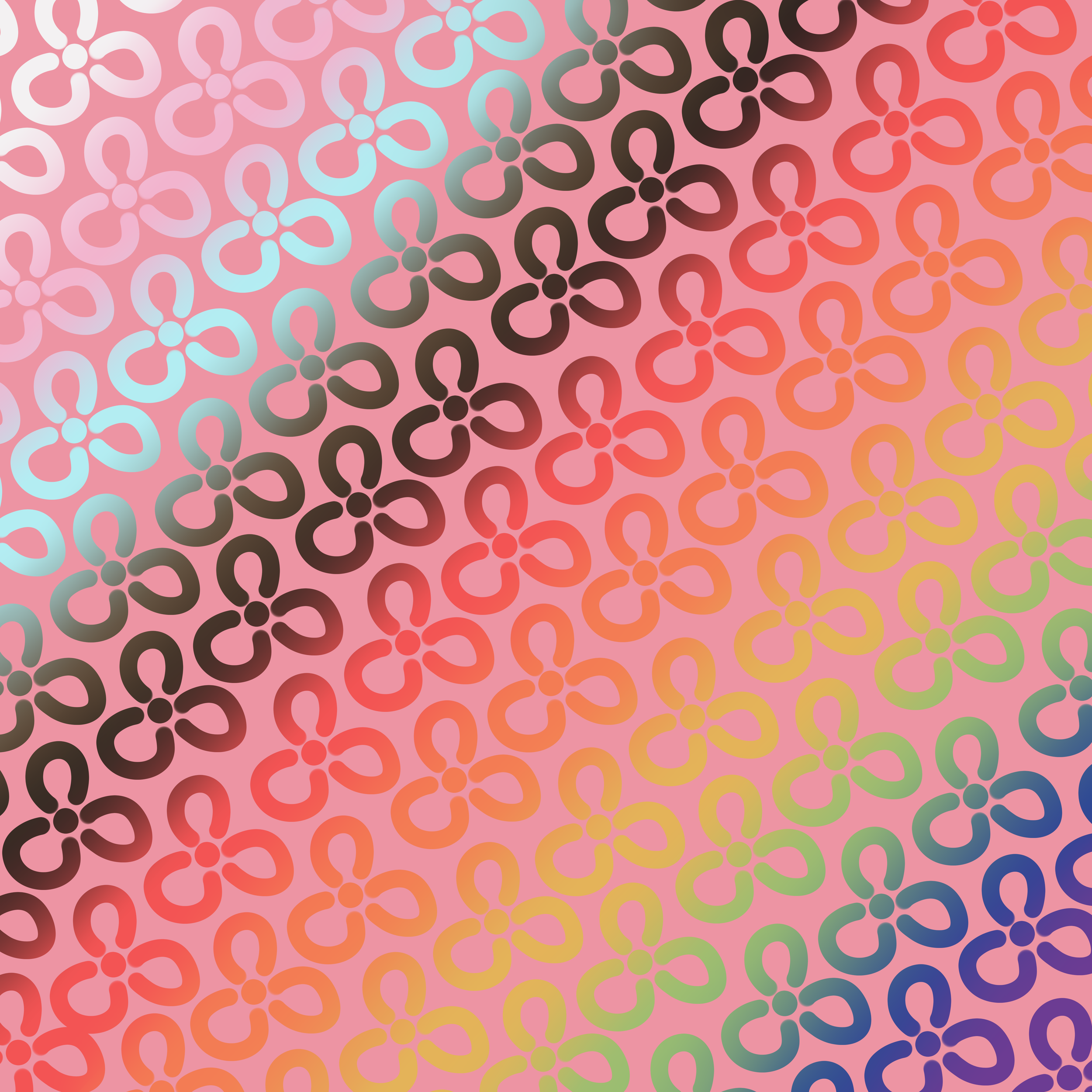
Keith Haring Inspired
Pride Pattern
Celebrating Craig’s longstanding support of the LGBTQ2S+ community, this pattern draws from the Pride flag’s colours and the expressive linework of Keith Haring. Using playful shapes and vibrant overlays, it adds energy and authenticity while aligning with the brand’s inclusive values.


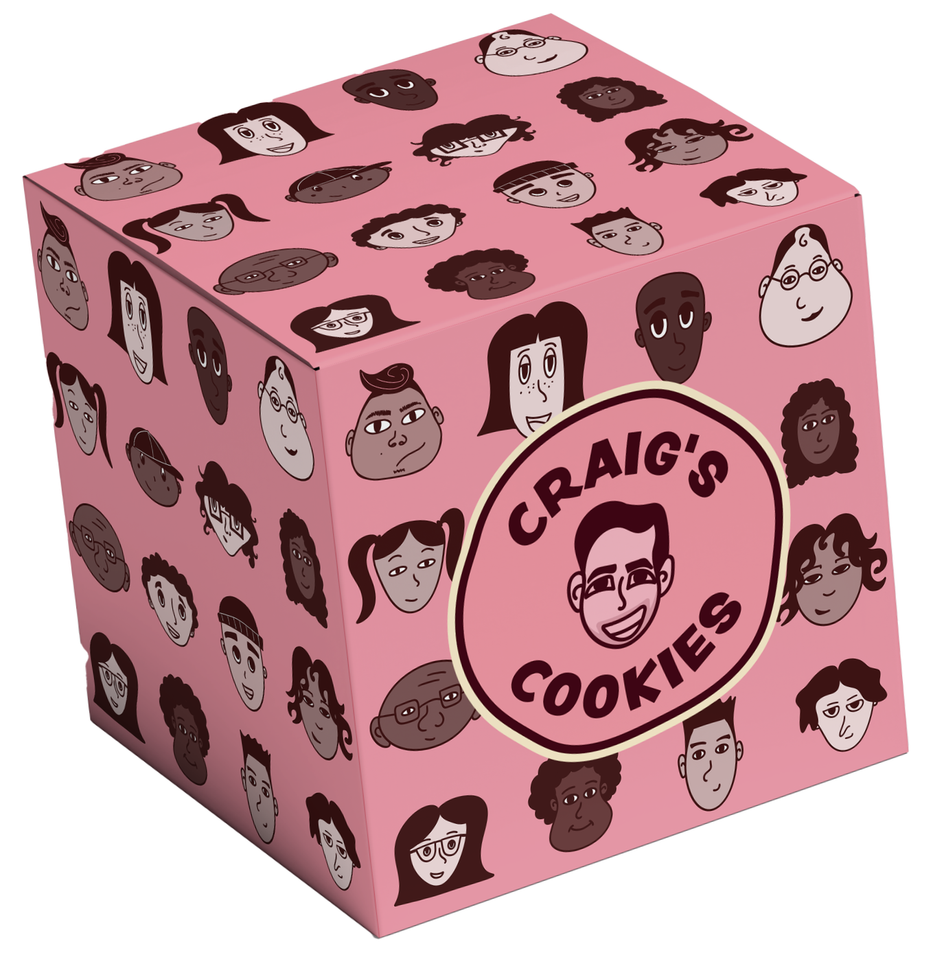
Community Pattern
Faces of the Community Campaign
As part of a limited-time campaign, customers who purchase a dozen cookies will have the opportunity to be featured as one of the illustrated ‘faces’ on a special-edition box. This initiative spotlights the community Craig’s Cookies proudly serves and creates a meaningful way to involve customers in the rebrand.


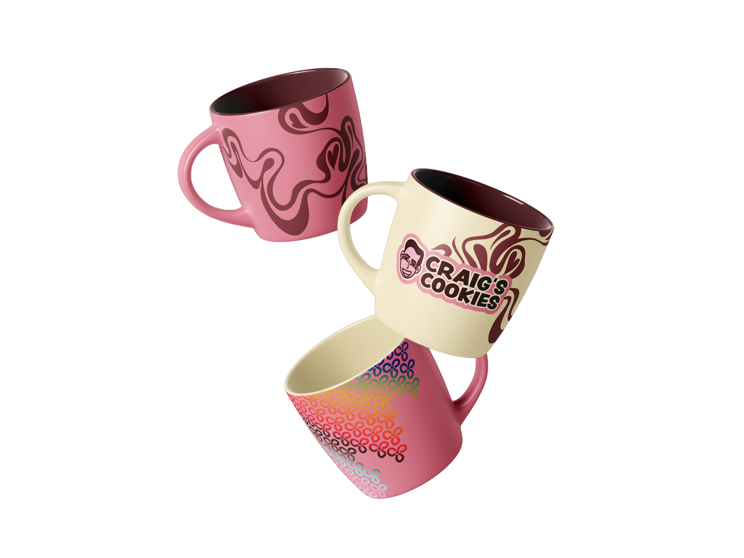
Merch Line
After the successful launch of its first-ever limited Pride-themed merch collection, I introduced the idea of a permanent line. This gives fans the chance to support and represent the brand in new ways year-round—extending the Craig’s Cookies experience beyond just the box.