Inner Odyssey
Nintendo Video Game Concept Design
Overview
Inner Odyssey is a Nintendo video game concept design inspired by the idea of experiencing human life without knowing the human experience. This series invites viewers into the inner workings of the body from a perspective that knows nothing about it, yet exists entirely within it.
The concept and designs turn familiar experiences into dramatic, call-to-action visuals. By placing viewers in unexpected perspectives, the series creates intrigue through a blend of humour, detail, and relatability.
Role
Sole Designer
Tools
Illustrator, Photoshop
In The Making
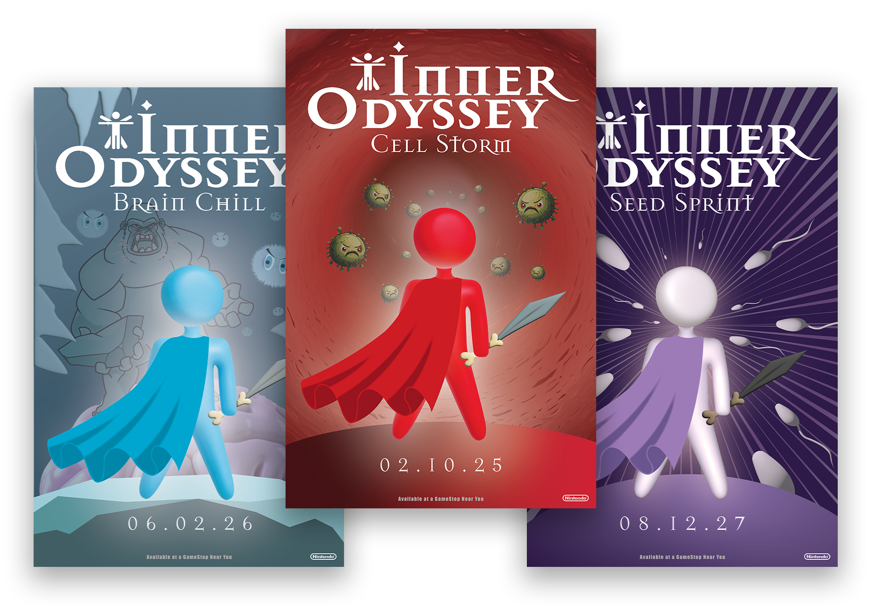
Each game cover is designed to reflect the nature of the game; its environment, its antagonist, and the central challenge the player must overcome.
By keeping the hero in the foreground, the perspective positions the player as stepping into an entire world and confronting its villain head-on. Because the series is aimed at a younger audience, the depth of each title remains closely tied to its core concept, ensuring clarity and accessibility.
Character Development
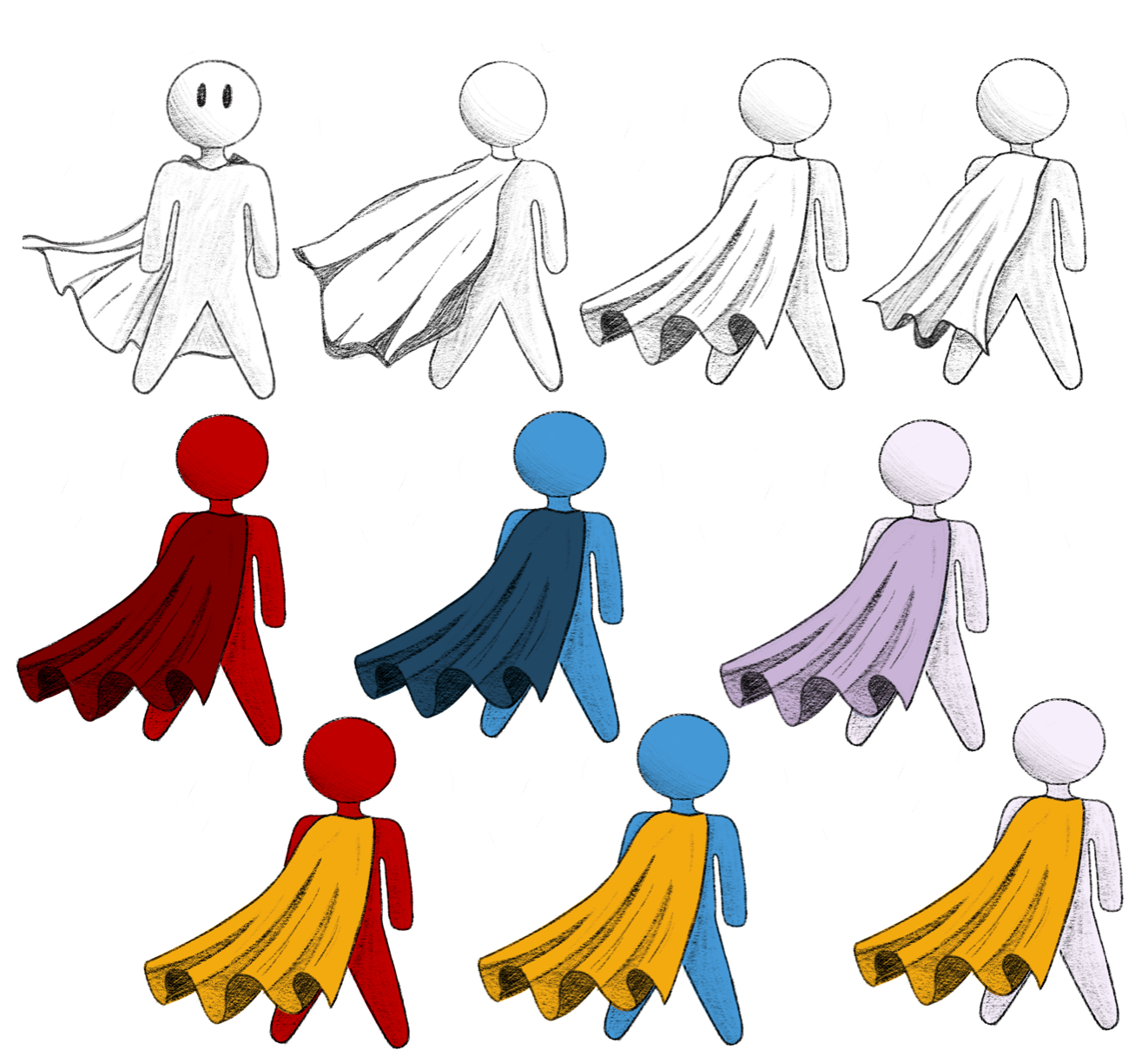
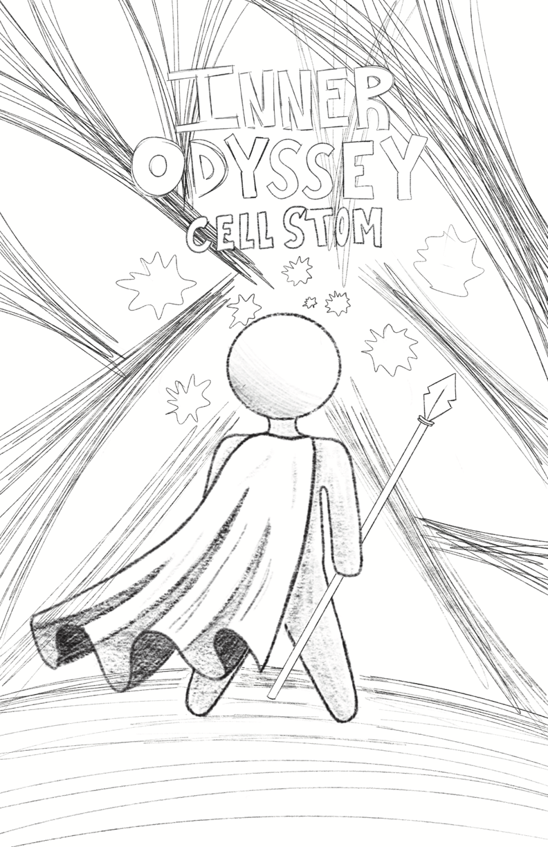
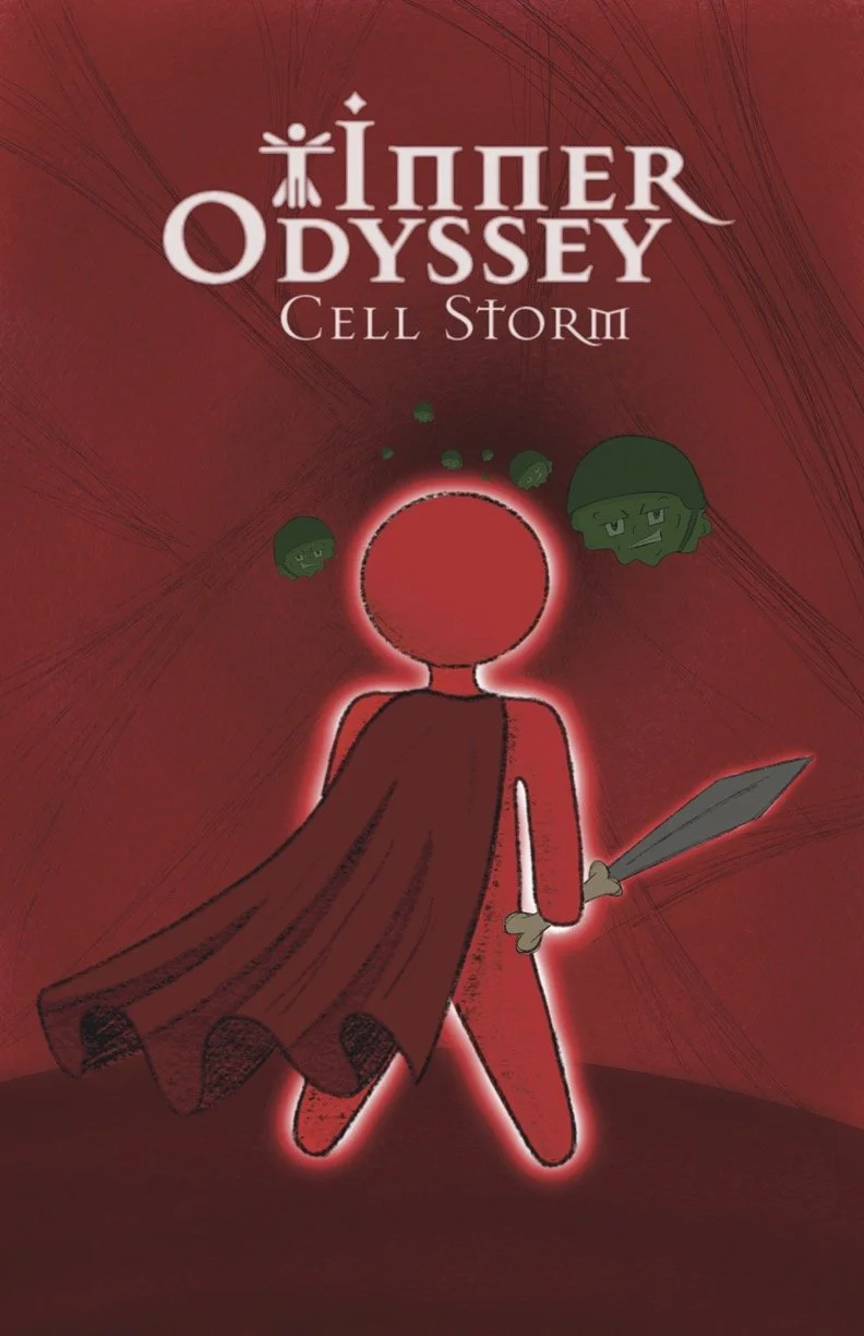
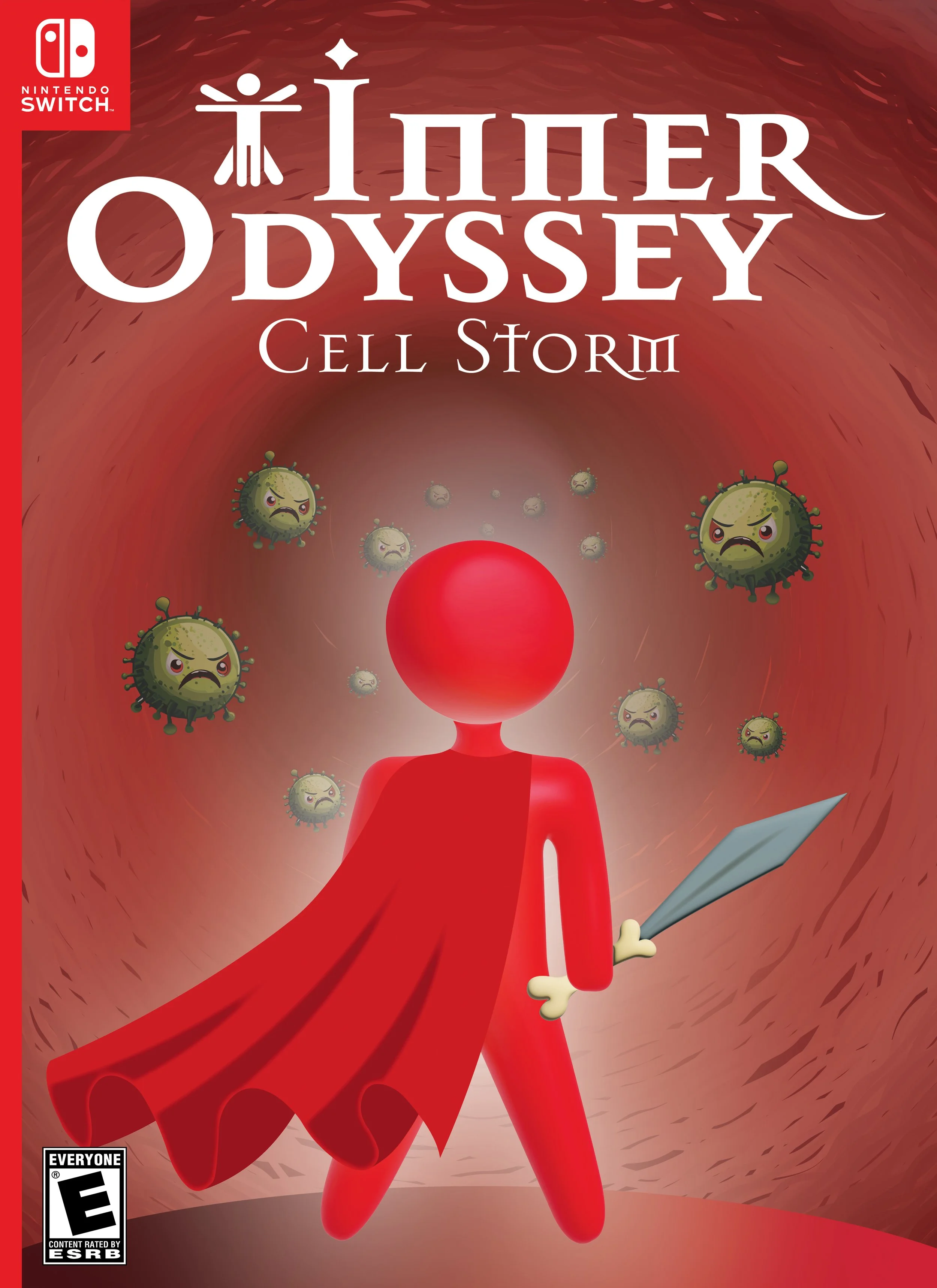
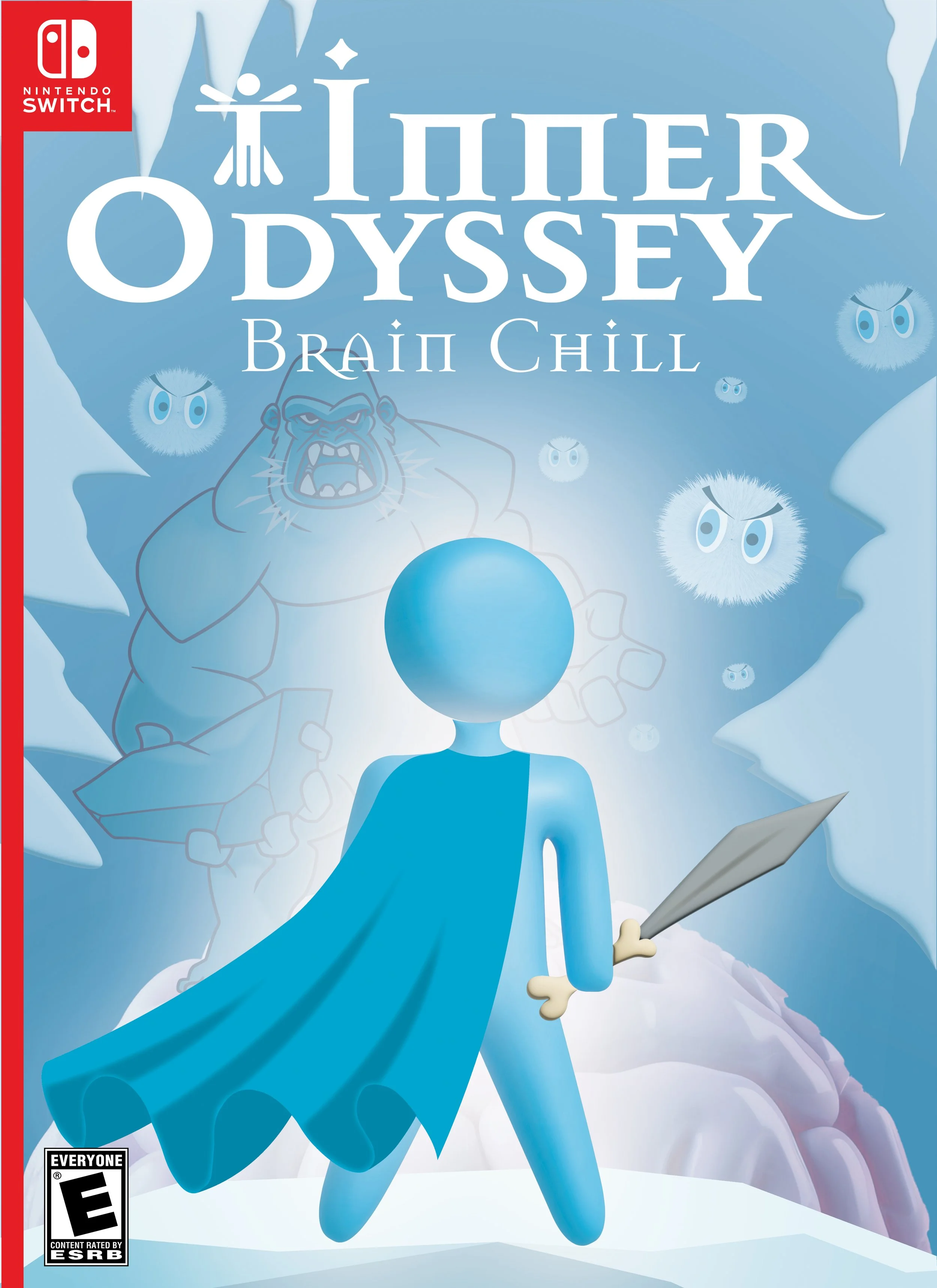
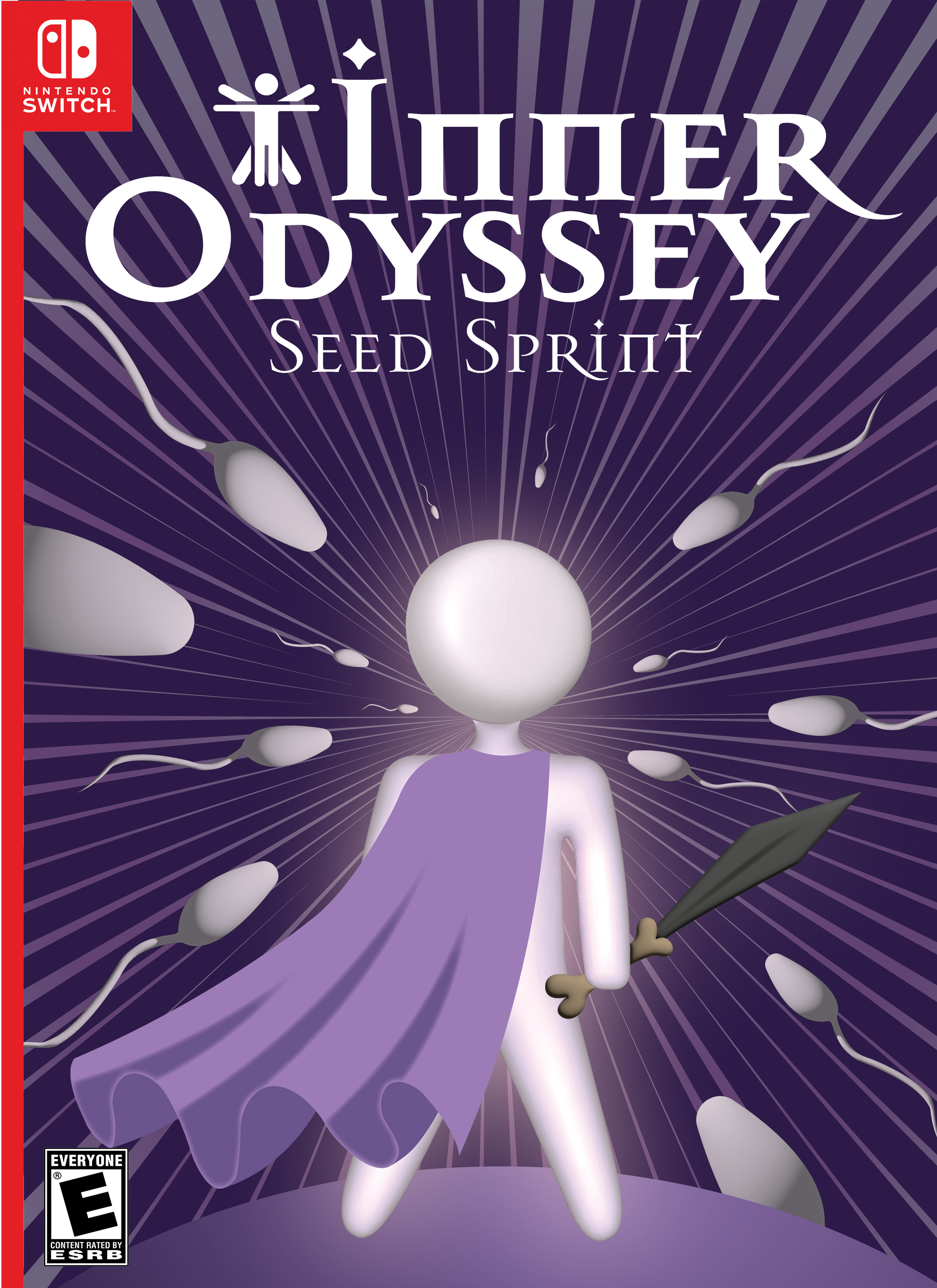
The character is placed at the centre of the design, reflecting the conventional video game covers. Its microorganism-inspired form connects to the game’s cellular perspective, while the cape introduces a heroic quality and adds motion and dimension to an otherwise minimal figure.
Title, Font & Icon
The title Inner Odyssey was chosen to be both direct and evocative, drawing players into a fantastical journey. The selected font conveys the feeling of a medieval quest—primitive yet noble, stripped down yet grand. The Da Vinci-inspired icon symbolizes the harmony between humanity and the universe, as well as the connection between art and science, tying directly to the game’s conceptual origins. Together, the typography and iconography create a sense of timelessness and adventure, positioning the series as both imaginative and grounded in universal themes.
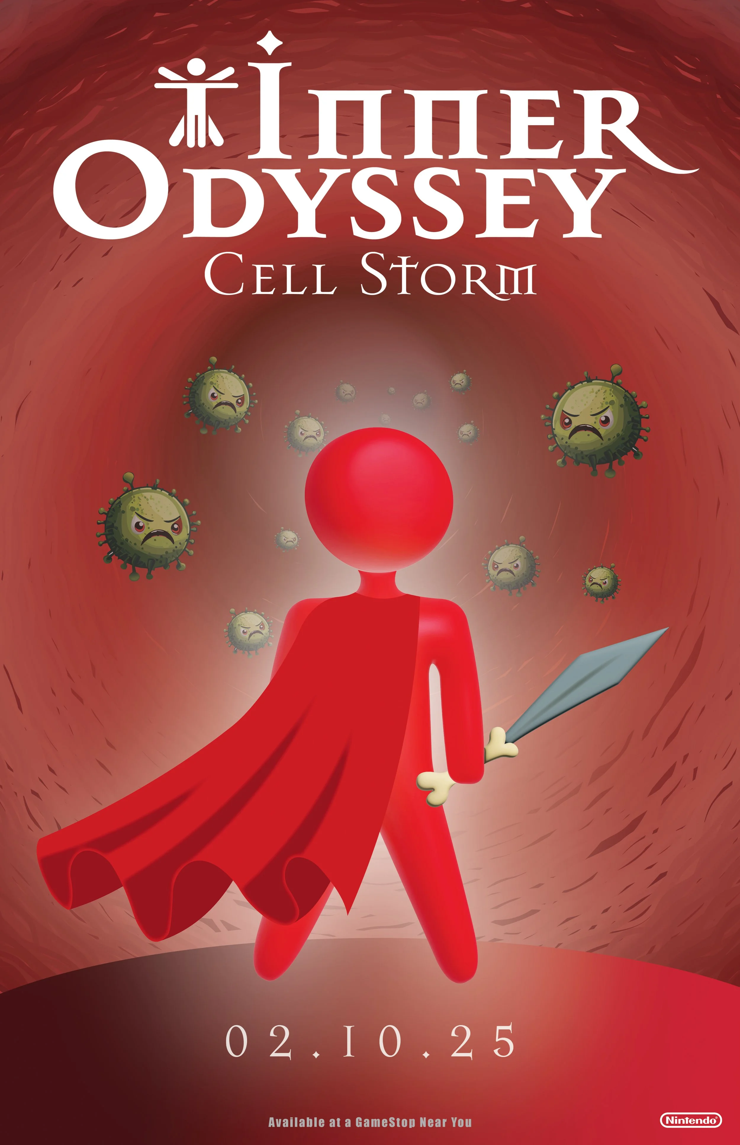
Cell Storm
In Cell Storm, a virus invades the body and races through the bloodstream. The player’s mission is to defeat waves of viral enemies while building an army of white blood cells to fight back. As the launch title of the Inner Odyssey series, the concept was intentionally bold, simple, and universally understood. The vivid red palette conveys intensity and urgency, while the looming viral antagonists closing in on the hero create a strong sense of danger. The textured vein environment feels both recognizable and abstract, grounding the setting in biology while also evoking a dreamlike, otherworldly battlefield.
Brain Chill
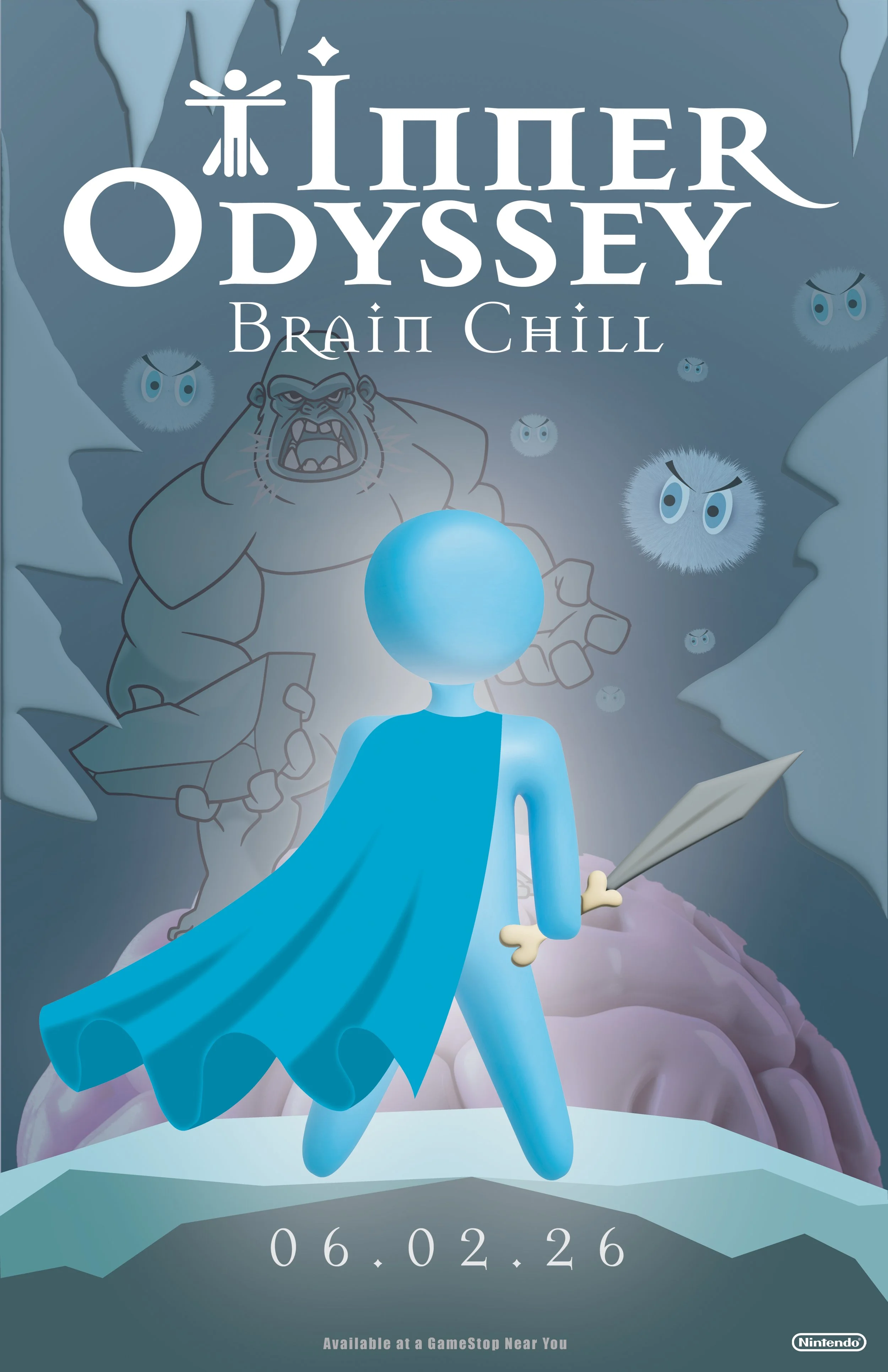
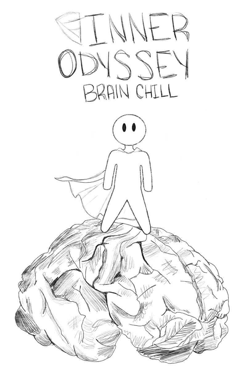
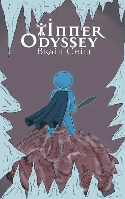
Brain Chill draws inspiration from a universally familiar sensation: the brain freeze. The game takes place entirely within the head, now transformed into a frozen tundra ruled by a snow beast and its army. The objective is to defeat this villain and restore the brain to normal function before time runs out. By introducing a single, more daunting boss supported by an army reminiscent of Cell Storm, the game builds on the familiarity of the first release while raising the stakes. A cool, monochromatic palette separates it visually from Cell Storm while maintaining continuity through the same layout, hierarchy, and central hero figure, signalling to players that this is both a familiar and elevated experience.
Seed Sprint
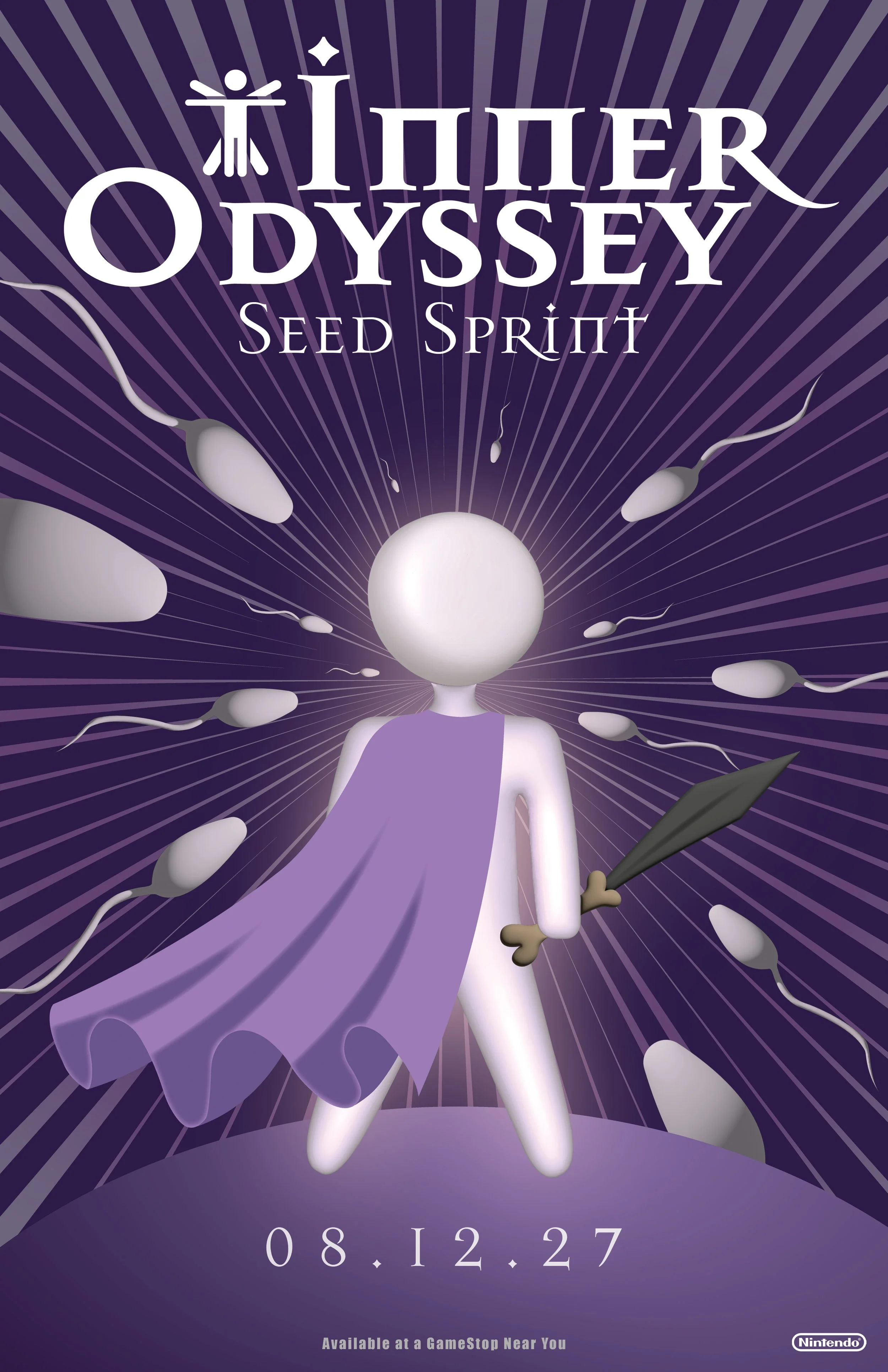
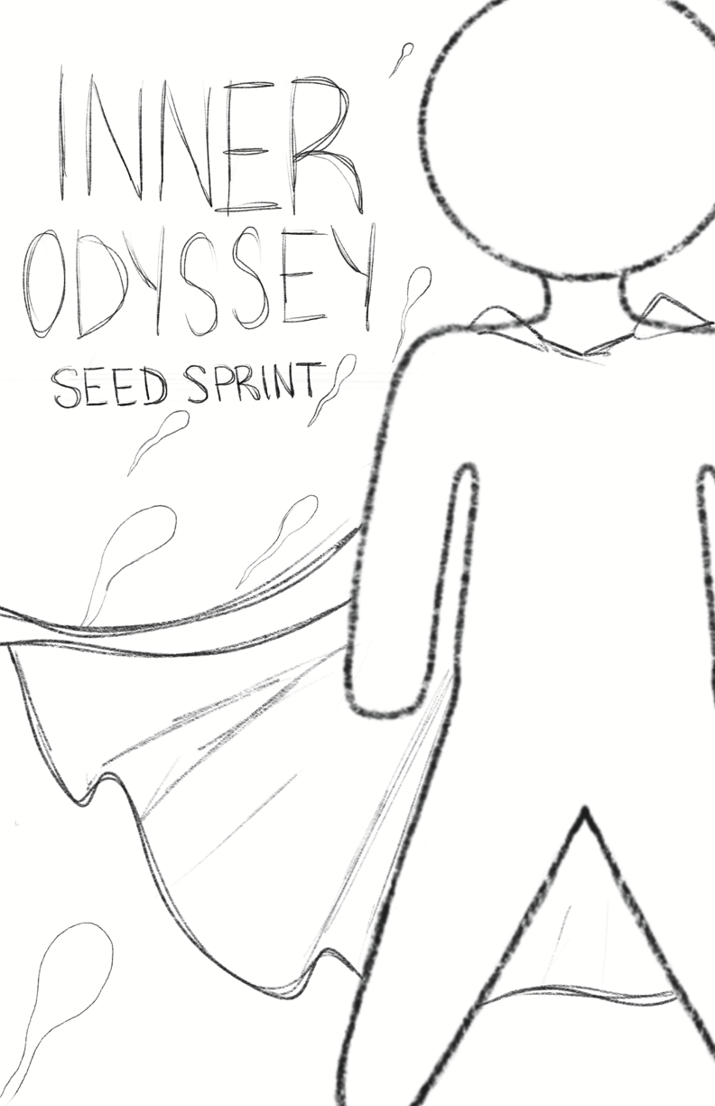
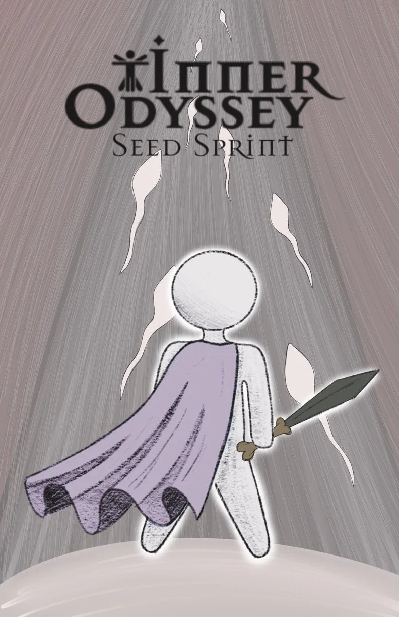
As the series evolves, so does the body. Seed Sprint moves into the reproductive cycle, transforming gameplay into a high-speed race for survival. Players are thrust into the ultimate dash to the finish line, competing directly against rivals. To remain in line with Nintendo’s content guidelines, the design avoids explicit or graphic references, instead opting for a neutral, non-literal purple color scheme. Dynamic radial lines communicate speed and clearly establish the racing genre, while the opposing figures define the competition. Although Seed Sprint departs more noticeably from the combat-driven style of the first two titles, this expansion opens the series to new audiences and varied gaming interests. Yet, through consistent use of layout, hierarchy, and central hero design, it still remains true to the Inner Odyssey identity.


